Team 1: Team Icarus
In order to design logos for my teams I had to first draw a few different draft sketches, I decided that I wanted the first logo to look like a pair of wings for the team ‘Icarus’ ; I experimented with different styles but settled on a tribal kind of pattern because this would look best digitally and give it a more slick design.![]()
Team 2: Valkart:

![]() For my second team; ‘Valkart’ I drew a few different version of the Norse Valknut, I thought that this design would be perfect for a logo and so I made a few variations and chose my favorite one to develop. Inspired by the northern lights I chose to give this one a blue gradient coming out of the side, this adds a professional finish to the design and some much needed colour.
For my second team; ‘Valkart’ I drew a few different version of the Norse Valknut, I thought that this design would be perfect for a logo and so I made a few variations and chose my favorite one to develop. Inspired by the northern lights I chose to give this one a blue gradient coming out of the side, this adds a professional finish to the design and some much needed colour.
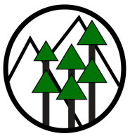 Team 3: Alpine Racing
For the third Logo I wanted to do a simple design and decided to have 3 low poly trees that represent ‘Alpine Racing’.
I played around with the idea of having a gradient for the sky but ended up deciding that would be too similar to the team Valkart logo. Below is some sketchbook development of my logo. 
